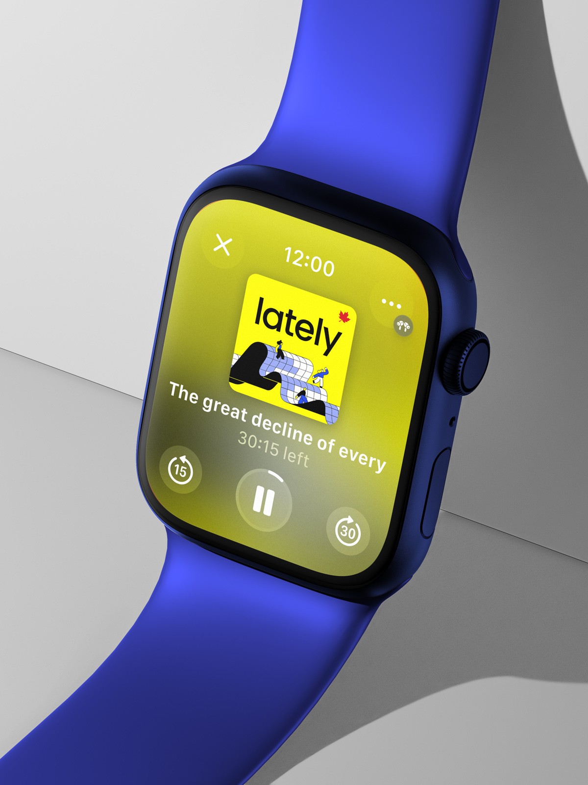
Hosted by policy expert Vass Bednar and produced by Katrina Onstad, Lately is a business and tech podcast from The Globe and Mail about navigating life in the new economy. Aimed at GenZ and Millenials, the weekly 30-minute dispatches break down the latest business headlines and defining tech trends — from digital serfdom, to the enshitiffication of everything online, the ADHD economy, and more.
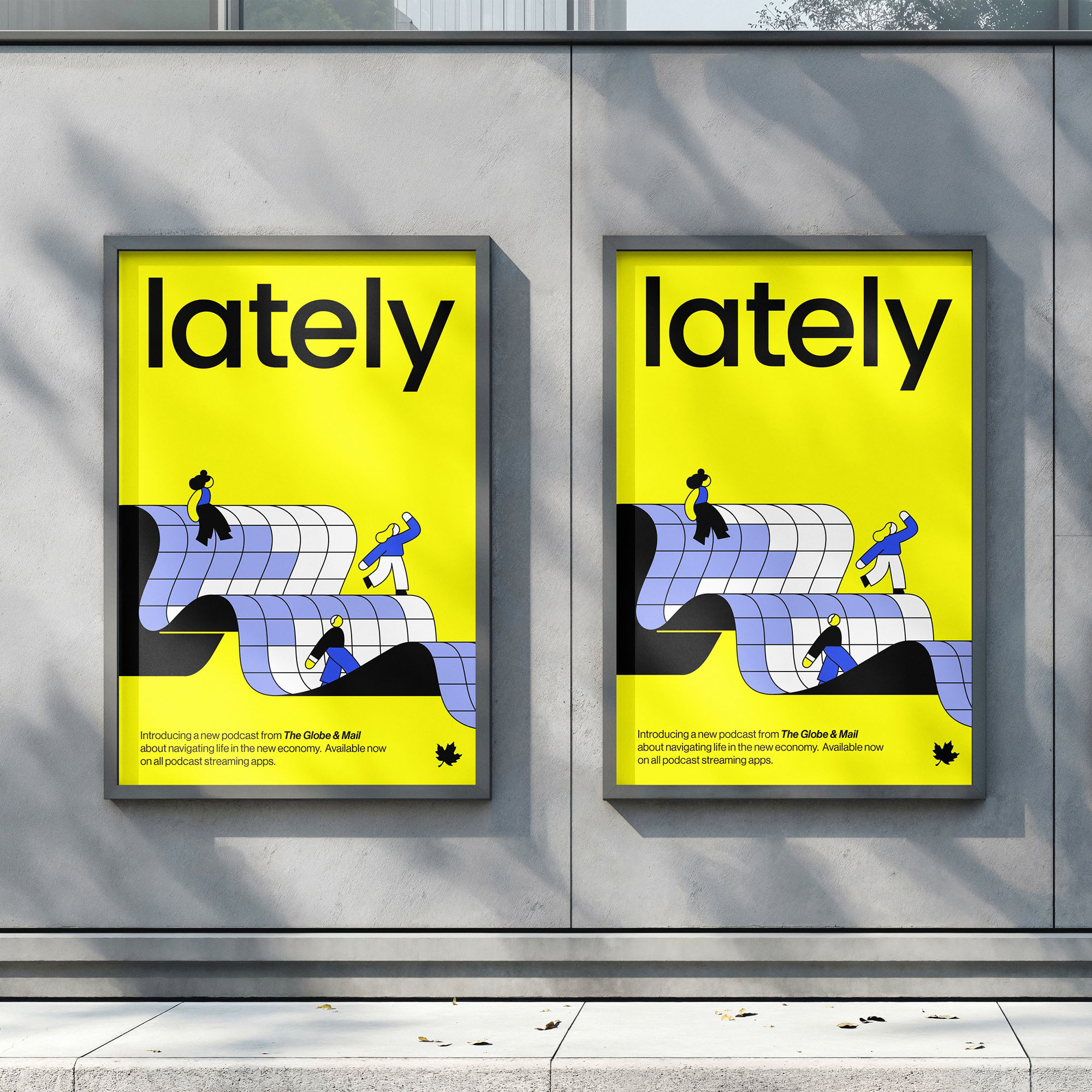
We worked closely with illustrator Rose Wong, playing to her strengths to simplify and distill the essence of the show into a compelling cover illustration. As visual impact and legibility at a very small scale were important, we chose a friendly modern sans-serif typeface with generous counters and opted for a punchy Y2K-reminiscent colour palette.
The final identity is approachable, bold and fun — the cover matches the tone of the show and stands out in the user's library.