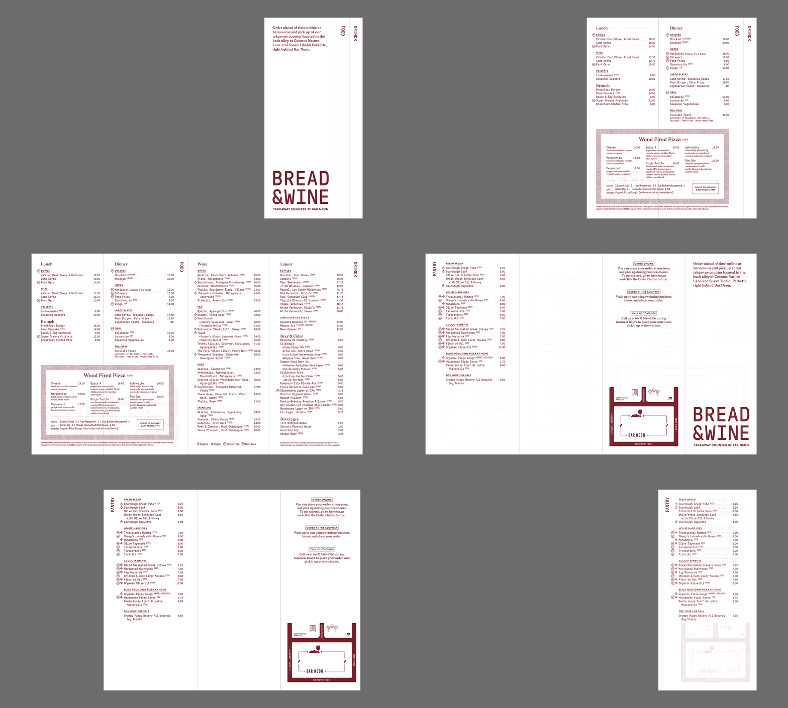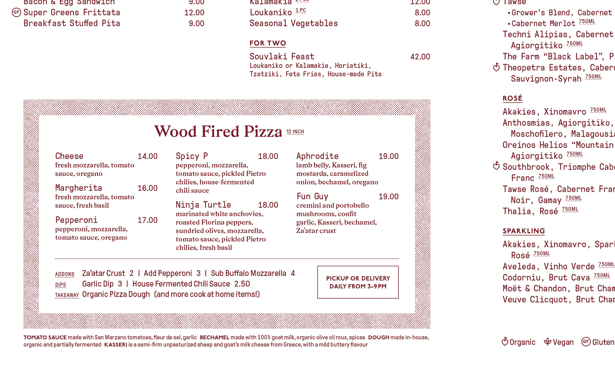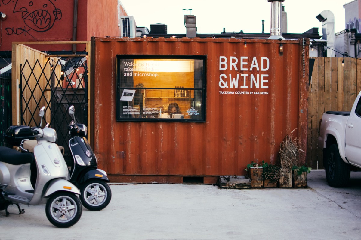
Struggling to keep their small restaurant afloat during the early days of COVID, Bar Neon decided to repurpose an old storage contaniner as a temporary take-away counter and microshop.
The container had been tucked away behind the restaurant for many years, and was already part of the laneway’s landscape. We settled on a quiet intervention, allowing the neighbourhood to naturally notice the change, while directing traffic from the front of the restaurant on the main street.
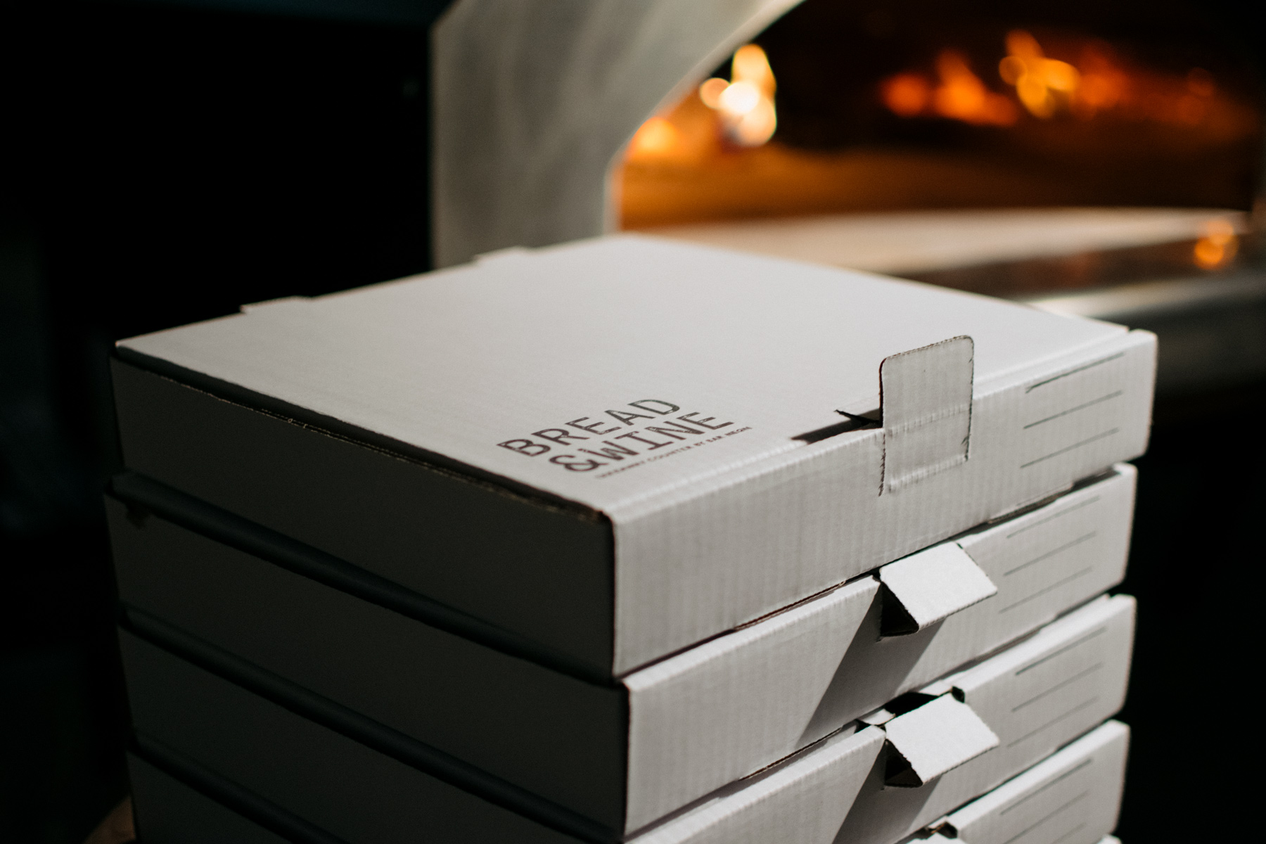
For the wordmark we leaned into a typeface inspired by letters stamped onto shipping boxes — talk about a perfect match.